In the beginning this article was an “index.html” saved in the “glitter” folder. Then it got the working title “The work of users in times of perfect templates”. Then it became “Rich User Experience for the Poor” and was presented at the New Network Theory conference. After the presentation, UCSB professor Alan Lui suggested to rename it to “Homesick”. But for the moment I'll leave it as
Vernacular Web 2
Two years ago I wrote an article titled “A Vernacular Web”, in which I tried to collect, classify and describe the most important elements of the early Web – visual as well as acoustic – and the habits of first Web users, their ideas of harmony and order.
I’m talking about everything that became a subject of mockery by the end of the last century when professional designers arrived, everything that fell out of use and turns up every now and again as the elements of “retro” look in site design or in the works of artists exploring the theme of “digital folklore”: the “Under Construction” signs, outer space backgrounds, MIDI-files, collections of animated web graphics and so on.
|
If you are missing the way pages looked before, you should install The Timemachine Firefox Add-on by Tobias Leingruber.
|
And today, in the end of June 2007, when we hear of amateur culture more often than ever before, the cultural influence of “Welcome to My Home Page” web pages looks especially interesting. People who created them and their ideas of what the Web is, how it can be used and how the pages should look, these people’s likes and mistakes gave the today’s Web its current shape.
To me, what defines the history of Web is not just the launch dates of new browsers or services, not just the dot-com bubbles appearing or bursting, but also the appearance of a blinking yellow button that said “New!” or the sudden mass extinction of starry wallpapers. Jenkins wrote in his 2002 article Blog This!:
“We learned in the history books about Samuel Morse's invention of the telegraph, but not about the thousands of operators who shaped the circulation of message.”
To rephrase him, I’d say we’ve studied the history of hypertext, but not the history of Metallica fan web rings or web rings in general.
The relationship between ordinary users and the Web of the 90s is a very interesting subject to study, because it’s a relationship filled with love, hate, all kinds of drama – in other words, it’s a full-blown relationship between a new medium and its first users, a relationship that’s exalted, complex, sometimes silly – whatever it is, all that matters is that it existed.
Today, that relationship is gone. And for a good reason. The space that we’ve researched as a new medium for the last ten years has turned into the most mass medium of them all. Nothing more than a mass medium, permeating our daily lives to the point of becoming invisible. Its numerous users are busy working, having a good time or expressing themselves, and they have almost perfect tools and services at their disposal. Connection never breaks, distinction between a server and a hard disk, between your desktop and that of another person has almost vanished, and there’s nothing that could contribute to the development of user-media relationship, nothing to provoke us.
Web 2.0 propagandists can’t stop talking about the multitude and power of today’s web amateurs, the new users who love to dance, compose songs, write encyclopedic articles, take photos and film videos, write texts and publish it all on the Web. And yet, they are rather indifferent to the Web itself.
So, here’s the question: how does the Web look now, when it’s no longer seen as the technology of the future, when it’s intertwined with our daily lives and filled by people who are not excited by the mere fact of its existence?
At a first glance, this question looks like a purely aesthetic one. One might think it’s almost unimportant. But in fact, nothing demonstrates the state of the Web in general and the state of its services, in particular the ones that follow the Web 2.0 ideology, as clearly as the style and look of ordinary users’ home pages.
Garden Gnomes
I guess I took it a bit too far when I called them “home pages”. Home pages no longer exist. Instead, there are other genres: accounts, profiles, journals, personal spaces, channels, blogs and homes. I’d like to pay special attention to the latter ones.
Professional web developers and designers scorned home pages (namely, personal home pages) starting from the mid-90’s. In an 1998 interview to W3J, Tim Berners-Lee formulated his attitude to private home pages:
“They may call it a home page, but it’s more like the gnome in somebody’s front yard than the home itself.”
Pioneer of Russian web designer, Artemi Lebedev, included home pages and their creators in his hate list, next to boiled onions and the Caps Lock key.
Two years ago, the Dutch interaction designer Hayo Wagenaar, with whom I shared a panel at the Decade of Webdesign conference, flung a remark:
“The question is, what do we think of amateurs getting involved in web design? It feels like getting stuck on the highway behind a caravan.”
Little by little, home pages became the lowest possible lifeform on the Web – it became terminally uncool, and in the end, useless to have one. Now, if you want to expose yourself to the world simply and effectively, you’re supposed to go to a site specifically designed for this purpose. The new generation of Web users create accounts, profiles, journals, spaces, channels, or blogs. The old generation had to move as well.
I’m far from imagining this process as painful and dramatic, though there are examples that cause mixed feelings – like, for instance, when the heroes of the 90’s such as Peter Pan convert their pages to another format, to the language of MySpace.
 Peter Pan's classic home page |
→ | 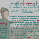 Peter Pan's Myspace Page |
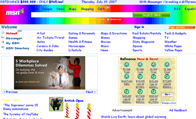
It’s worth noting, and can be of special interest for designers, that home pages in the other sense – meaning first pages of sites or projects – lost their significance as well. Nobody really needs them anymore. They have been replaced by a modest-looking Google start page, which wraps itself around every website like a dust jacket.
Interestingly, even though home pages no longer exist, every other service invites its users to re-create the feel of a home page, offers ways to personalize their space quickly and easily.
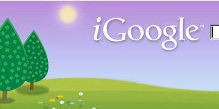
In March this year iGoogle, formerly known as Google Personalized Homepage, announced six new themes for their users: Seasonal Scape, Tea House, Bus Stop and others. On this occasion, Jessica Ewing, Google Product Manager, wrote in the official Google blog:
“… you can choose between the classic theme and the six new themes we’ve designed. We hope this feature makes the Google homepage feel a little more like, well, home.”
Why does Google want us to feel like home on their pages? Not to bind us to themselves, that’s for sure – they don’t need that; they’ve already got us hooked. When they offer me to “feel at home”, they mean something different. They mean home as opposed to work. What they’re saying is “Relax, have fun. Play around while we work. We are professionals; you are amateurs.”
In his preface to “0 Comments” Geert Lovink noted – it was related to a different subject, namely the CC license, but I still want to quote him –:
“The exclusive focus on young and innocent amateurs that just want to have fun, and the resentment against professionals is not accidental. Amateurs are less likely to stand up and claim a part of the fast increasing surplus value (both symbolical and in real money term) that the Internet is creating.”
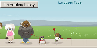
It might sound paradoxical, but by encouraging the user to “feel at home” services create more distance between the users and themselves. Simplistic, silly graphics, senseless gadgets, customized pages with virtual puppies and kittens of the day heaped together with CNN news and bites of wisdom from Oprah – all of that subtly serves to show the user his proper place.
|
It would be futile to compete with iGoogle in absurdity, but I think that a young artist Helene Dams managed to put it very well in her work iGnomes. Ten years later, Tim Berners-Lee’s caustic remark “But it’s more like the gnome in somebody’s front yard than the home itself” acquired a new sense. It is also clear now who owns the home with the garden and who are the gnomes grimacing on a manicured lawn in the company of plaster ducks and real flowers.
Tom Moody responded to the announcement of Vernacular Web 2 on nastynets:
I wonder if there are class elements at work, too. In America poor people often have yards full of junk and the rich aspire to the “spare artist loft” look. Amateurs can’t hire their own CSS designers and end up filling up their pages with those garden gnomes because they don’t know any better. Whereas a website with money backing hires an “interior decorator” whose first instinct is to get rid of all the junk.
Translucency
If you look at the most viewed layouts on MySpace, you’ll notice that most of them have a big picture as a background, which repeats itself horizontally and vertically. This back-to-1996 design flaw is now forever linked to Web and amateur users, and nobody cares about eliminating it – neither services nor users themselves.
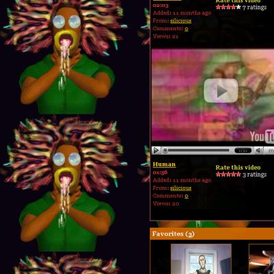
Full screenshot, plus extra myspace screenshot |
When browsing through MySpace user profiles, YouTube user channels and user accounts in the English-speaking cluster of LiveJournal, it’s impossible not to notice how alike they look and how they resemble their Web 1.0 predecessors. Despite the diversity of multimedia elements, new graphics, design styles, and new tools, non-professional user pages differ from the professional ones just as clearly as a decade and a half ago.
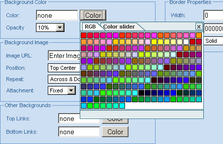
The main difference is that professional pages mimic the look of other media, and amateur ones are tied to HTML-based aesthetics, which is based on modular approach.
If in the 90’s professional web design imitated existing paper or screen designs, Web 2.0 tries to mimic iPods and other gadgets born in the beginning of the third millennium. Еssential web look now, just as it was back then, consists of a background with blocks of graphics, videos and text superimposed upon it, with no clear structure to bring it all together.
In 1991, before the web, J.David Bolter noticed in “Writing Space: The Computer Hypertext and the History of Writing”:
“Typographers and graphic designers who complain about the mess that naive users make on their terminal screens are themselves children of a different technology and are apt to judge the computers writing and drawing space in the wrong terms.”
So, user profiles have kept their legacy and followed a certain tradition, whether intentionally or not.
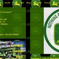
But there’s a new distinctive feature I’d like to investigate. Sites are becoming translucent. Since recently, the Myspace profile editor allows to set opacity for blocks on the page from 10 to 100%; YouTube offers their users a 50 to 100% transparency option when designing their channels.
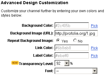
|
It’s hard to pass on such a great offer. An effect that takes minutes to achieve with Adobe products can be achieved on the Web in milliseconds. At the expense of usability, pages acquire a haunted, immaterial look.
See-through amateur sites in their way follow the trend in contemporary interface style very well, which is all about taking user interface farther away from the old “desktop” metaphor, making it look light, almost ethereal.
As we know, in the area of HCI study the term “transparency” has the meaning opposite to that in optics and common speech, that borrowed it from optics – which, too, often leads to ambiguity and can create misunderstandings. But the most serious problem is that systems that are genuinely light, intuitive and transparent from a developers’ or interface designers’ point of view are not counting on users’ competence and ability to see and understand how things work.
In 2004 Sherry Turkle noted in the introduction to the special edition of “The Second Self”:
Macintosh meaning of the word transparency had become a new lingua franca. By the mid 1990s when people said that a system was transparent they meant that they could immediately make it work, not that they knew how it works.
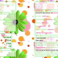
Each one of those thoughtlessly translucent sites that takes 30 seconds to design while a user has no idea of how it really works is a great illustration of the transparency concept in HCI in general.

|
|
|

|
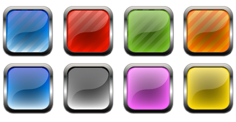
And the aforementioned professional look of the Web 2.0 – the “glossy round edged style” that has become the talk of the town and provoked many parodies – is based on translucency as well, but there it follows a trend in contemporary electronic gadget design and imitates Apple’s cool and expensive candy-colored plastics.
I can imagine that in the nearest future “translucency” may become a term just as contradictory as “transparency” is now, due to the different phenomenas that inspire web makers today: ethemeral desctops and glossy plastics.
