Prof. Dr. Style
Top 10 Web Design Styles of 1993 (Vernacular Web 3)
Codeword
Every term I give an introduction to Interface Design studies to new students. 99% of them are under the delusion that the design of everything in the world is made in Photoshop or other Adobe products. In case the design is to be perceived on a computer, these Adobe files will be thrown into a room full of programmers who are longing to make it all interactive according to noble ideas embedded in the graphics. So the task is to show non-fictional challenges of new media and to explain why to study Interface Design. (To make it short here: interface designers develop projects that will be handed over to photoshoppers to put gradients on buttons.)
Most of the students will not be convinced and will choose to study graphic design. Even those who want to be web designers. Though 17 years of the WWW show that you need quite a different skill set for that. That's why the last 3 hours given to me to influence people who will not study the web, but will design it anyway, I spent on highlighting the real history of web design styles. By real history I mean essential design trends rooted in technologies, believes and needs of their time, from 1993 to today. Imported visual trends1 are left outside of this timeline.
Big emphasis in my talk is put on the mid 1990's, an era when the web was build and arranged and decorated by amateurs, when very web specific genres and looks were brought to existence, making it an incredible place to experience.2
But what was earlier? How did the World Wide Web look before this Internet boom, before it became a riot for star backgrounds, bouncing envelopes and under construction signs?
Well, in 1991, Tim Berners-Lee went live with the first web page
TheProject.html located inside the hypertext/WWW/
folder on a computer called "nxoc01" at CERN. Neither him, nor
any of his colleagues made an effort to preserve this first version.
The only thing we know is the URL
http://nxoc01.cern.ch/hypertext/WWW/TheProject.html
and the way the first page ever looked in november 1992.
That's early enough, still half a year before the Mosaic browser would
be released and people outside of CERN would start to make their
pages.
It is difficult to estimate how many pages created in 1993-1994 made it into the new millennium in their primordial way. If you manage to find something that was put online that time, it would in the best case display a 1995-1996 skin, like the Russian Space Science Internet -- redesigns clearly shaped by the then-new Netspace browser.
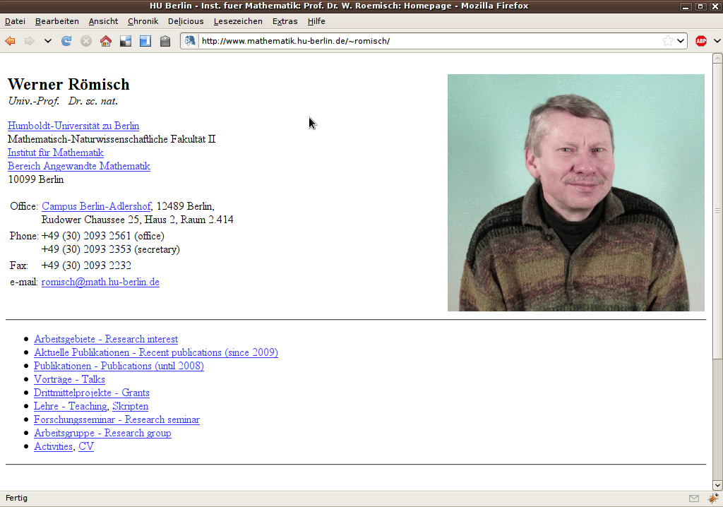
But there is a way to find pages that live for ever in 1993. To present them to the new students I look for "Prof. Dr." in Google. Some semesters ago it was possible to make a life performance with this search. Pages of academics in style were top results. As of June 2010, the magic seems to be gone. To collect enough examples for this article I had to go till result page 110.
"Prof.Dr" is a codeword, a tricky search request. I am aware of the fact that there are users outside of academia as well who always designed their sites in pure markup or redesigned according to 1993 standards recently. Still I suggest to use this name based on a scientific title as a tribute to the history, and reminder that all around the internet the very first pages were build at universities. To cement this term, within this article I'll use only pages of senior academics holding a doctoral title.
URL
It makes sense to check pages with a tilde in their address. But there is no direct connection today in between URL and page appearances, a "~" is no guarantee that the page will be made in real Prof. Dr. style. Anything from a corporate university look to a generic corporate look can be encountered.
| name | URL | URL style | design style |
|---|---|---|---|
| Prof. Dr. Edward L. (Ned) Wright | http://www.astro.ucla.edu/~wright/~wright/ | tilde | Prof.Dr |
| Prof. Dr. Marcus Grote | http://www.math.unibas.ch/~grote/ | tilde | corporate university |
| Prof. Dr. Christian Dustmann | http://www.ucl.ac.uk/~uctpb21/ | tilde | generic corporate |
There are enough examples where the tilde is absent but the style of early web is 100% there:
| name | URL | URL style | design style |
|---|---|---|---|
| Prof. Dr. Reinhard F. Werner | http://www.imaph.tu-bs.de/home/werner/ | subdirectory | Prof. Dr. |
| Prof. Dr. rer. nat. Horst Köppel | http://www.pci.uni-heidelberg.de/tc/usr/horst/ | subdirectory | Prof. Dr. |
| Prof. Dr. Rainer E. Burkard | http://www.opt.math.tugraz.at/burkard/ | subdirectory | Prof. Dr. |
| Prof. Dr. Robert Hyatt | http://www.cis.uab.edu/hyatt/ | subdirectory | Prof. Dr. |
| Prof. Dr. Ronald L. Rivest | http://people.csail.mit.edu/rivest/ | subdirectory | Prof. Dr. |
It can even happen that Prof. Dr.s registered their own domain, but kept the style of web pioneers:
| name | URL | URL style | design style |
|---|---|---|---|
| Prof. Bernard Moss | http://www.bernardmoss.org.uk/ | own domain | Prof. Dr. |
| Rev. Prof. Dr. F.N. Lee | http://www.dr-fnlee.org/ | own domain | Prof. Dr. |
Though more often a domain name would mean that designers, photographers and project manager were consulted:
| name | URL | URL style | design style |
|---|---|---|---|
| Prof. Dr. med. Markus Suckfüll | http://www.professor-suckfuell.de/ | own domain | generic corporate |
| Dr. Prof. h.c. Hermann Scheer | http://www.hermannscheer.de/ | own domain | generic corporate |
| Prof. Paul Goddard | http://www.professorpaulgoddard.com/ | own domain | self-promotion |
| M.D. Oliver Sacks | http://www.oliversacks.com/ | own domain | self-promotion |
A "~" in the URL continues to be part of the look and reminds of early computer culture, when "user" was equal to "developer".3 That's why, where it is possible, I prefer to use the examples with a tilde.
Primitive and All the Same
Prof. Dr. pages tell the story of the web.
Not because they are retro. It is important to mention, that retro is the wrong term and notion in this case. Prof. Dr. doesn't mean at all that the site was made in 1993 and last time updated in 1995. The opposite. They are usually updated with a list of courses for the current semester or contain links to contemporary services like Google Calendar, twitter or embed Google Maps.
| name | last updated | connected service |
|---|---|---|
| Prof. Alan FT Winfield | 2010-06-08 | |
| Prof. Dr. Michael Bieber | 2009-02-02 | Google Calendar |
| Prof. Steffen Staab | 2010-06-01 | Tag Cloud |
| Prof. Dr. Rudolf Schmitt | 2010-01-26 | |
| Prof. Dr. Jörg Fliege | 2009-09-26 | Google Maps |
It makes them attractive for investigation -- they are actual and timeless. I mean you can open them in Mosaic 1.0 and it will not crash.
Still, if not retro, how to describe these pages? Prof. Dr. pages have their distinct appearance: primitive and all the same. And that makes them historically significant.
Primitivity tells us the story of the browser being not only a browser, but also an editor. Every user of the early web was a producer of web content. Web pages were to be opened in the browser to look at them, but also to edit them, using existing pages as templates for new pages. The simple design of HTML made it possible for the first users to create state of the art pages with only four to five principal tags. The result was an extremely fast growing web. There were not many options, this is why we got many pages.
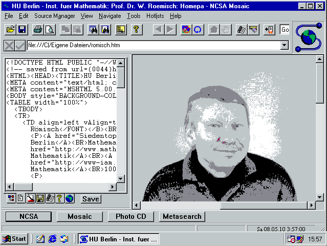
Next, Prof. Dr. pages look terribly the same. As if they were generated automatically by the browser, as one student said. Though, ironically, they are among the last pages generated completely by humans, not content management systems or services.
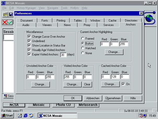
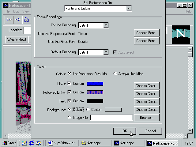
They look according to the viewer's browser settings. This reveals the belief of the early 1990es that any visual design should be left at the discretion of the user.
Page authors wouldn't define colors, fonts margins and line-lengths. In turn end users set their preferences for colors, fonts, links, graphics in their browsers, according to their needs or taste. Not a big deal, one can say, to decide if to see all the pages of the internet on a white or a gray background. But don't think about colors, think about the concept -- each user was defining the look of the whole WWW for themselves.
Wired journalist Gary Wolfer wrote in 1994:
"The beauty of this approach is that it allows maximum openness and flexibility. All World Wide Web documents are similar, but every World Wide Web reader, or browser, can be different."
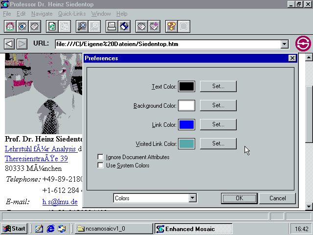
With the first version of Mosaic one could choose link colors. Later,
NCSA Mosaic allowed to decorate links in many different ways and choose
colors from an RGB palette. It was the highest moment of "preferences
freedom" a user could have.
The concept "End User = Designer" is long gone. It could only work for the very small4 web at connected universities.
What was enough to make academic profiles and papers look good online, became too less for the rest of us. Users didn't want to customize preferences for the whole internet in their browser, they wanted to make their pages individual and that this individuality is not lost in the browsers of others.
As soon as the WWW ventured outside of academia, the paradigm of the browser changed. In 1995 Netscape reduced the browsers' preferences palette to colors and fonts, while introducing new additions to HTML for defining the visual appearance of pages.5
The WWW, contrived in a Swiss Lab, became people's web.
From Prof. Dr. to Web Vernacular
It is very interesting to watch the transition from a primitive markup style of 1993 to pure madness of 1996 staying by Prof. Dr. search results. You can see all the small details that can make a particular Prof. Dr. web site leave the borders of Prof. Dr. style.
It would also important to stress that Prof. Dr. style is
only a style. It is not equal to pure markup. None of the
examples above would pass HTML1.0 validation. No wonder, Prof. Dr.s are
not professional web developers. They are making their pages by
editing code of their academic peers, who are non-professionals as well.
Very often headings are replaced with a combination font style tags like bold
and font size. Or the semantic <address> tag is
substituted with <pre>.
| name | tags | used for |
|---|---|---|
| Prof. Dr. Dr. h.c. Kurt Bauknecht | <pre> |
address formatting |
| Prof. Dr. Harry Buhrman | <pre> |
address formatting |
| Prof. Dr. Alex Shafarenko | <pre> |
address formatting |
I still consider pages that misuse visual markup for structural purposes as Prof. Dr. Style, as opposed to the pages where their authors make a step to "bring life" to their online home.
You don't have to be web design expert to see the difference in between personal the home page of Prof. Dr. Stephen Darwall and Prof. Dr. Harm Derksen. The first a typical representative of Prof. Dr. Style, the second a striking example of vernacular web.
There are also websites that look exactly like Prof. Dr. but aren't. Compare these two:
| name | changed defaults | web editing software |
|---|---|---|
| Prof. Dr. Wolfhard Janke | none | text editor / unknown |
| Prof. Dr. Richard J. Boucherie | background color, link colors, fonts | Microsoft Word 2008 |
Both seem like Prof. Dr. though only the first page is. Prof. Dr. Janke's links are blue and underlined, and when you click one it becomes red for a short moment to give feedback to the user that the click was indeed registered by the browser and the requested page is about to appear any time. It is a reminder of the days when the internet connection was not so swift and you could stare at an active link for a while, waiting for a server to connect and packages to arrive, feeling the effort the best effort network makes. And then you are brought somewhere far or close. You can go further following other blue underlined links, or you can go back and see that the link you just clicked became purple, so that you can distinguish visited links from unvisited ones.
Prof. Dr. Boucherie changed the default colors of his links (they are blue even when active and visited) and by this crossed the thin border that divides Prof. Dr. pages from amateur web and later styles.This visually unremarkable modification can't be compared with decorating a page with all sorts of animations and sounds and still it is an act of users' voluntarism that paved the way to both amateur and "professional" web.
Modifying colors of links was the first, smallest thing one could do. Sometimes it is a sign of its authors' curiosity and the will to fiddle with code:
| name | changed defaults | web editing software |
|---|---|---|
| Prof. Dr. Bernard Grofman | background color, link colors | WYSIWYG / unknown |
Quite often though the source code would reveal that the page was created using a word processing software that is able to make links, but fails to produce lively hypertext:
| name | changed defaults | web editing software |
|---|---|---|
| Prof. Dr. Gerhard Brewka | background color, link colors, fonts | Netscape 4.78, Microsoft Word 10 |
| Prof. Dr. Sarah Cook | background color, link colors, fonts, font sizes | Microsoft Word 10 |
A curious example: Prof. Dr. Kender made a Prof. Dr. page. His Ph.D. student, Hassan H. Malik, opened the page of his mentor in Microsoft Word and made one for himself. The links are there, blue and underlined, but they are numb.
The next step is to play around with text in general. Formatting it, changing font size, bringing color, ...
| name | text styles |
|---|---|
| Prof. Dr. Cliff Burgess | colors, sizes |
| Prof. Dr. Walter Kohn | headline color |
| Prof. Dr. Carsten Timm | colors, sizes, removing underlines from links | Prof. Dr. Dines Bjørner | colors, sizes, small caps |
| Prof. Dr. Günther Rüdiger | blink |
... arrogantly making it blink6, like Prof. Dr. Günther Rüdiger made for the "Current Issues" heading of his website. Blinking is the pimp among HTML tags, you should be very self confident to have it on your page.
The next logical step after bringing colors to the text is to customize the background color:
| name | background |
|---|---|
| Prof. Dr. Martin L. Kersten |
#FFFDDC
|
| Prof. Dr. Freddy Delbaen |
#CCCCCC
|
| Prof. Dr. Markus Schneider |
rgb(255, 255, 238)
|
| Prof. Dr. Jillian T. Weiss |
#000000
|
| Prof. Dr. Aravind Srinivasan |
#FFFFEE
|
| Prof. Dr. Madelaine Böhme |
#e0d2ff
|
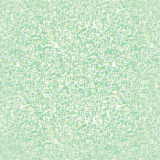
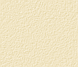
There are 216 web safe colors and more than 16 millions colors in general, but for somebody really passionate about their webpage, it will never be enough -- and the background color will be replaced with a background image:
| name | background |
|---|---|
| Prof. Dr. Eugene (Gene) F. Milone | |
| Prof. Dr. Adrian Bowyer | |
| Prof. Dr. Peter Hänggi | |
| Prof. Dr. rer. nat. Ernst Kausen |
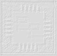
A Background image can be just a nice looking pattern, as in the pages above, or can point out the research field the Prof. Dr. is active in:
| name | background | observation |
|---|---|---|
| Prof. Dr. Huybrechts | "wpaper.gif" is a quite neutral pattern, but knowing that Prof. Dr. Huybrechts researchers large-scale three-dimensional time-dependent thermomechanical continental ice-sheet models, it is easy to assume that it was chosen because it looks a bit like a glacier. | |
| Prof. Dr. Paul J. Crutzen | Recipient of the Nobel Prize in Chemistry, Prof. Dr. Paul J. Crutzen, has clouds on his page, because he is an atmospheric chemist. | |
| Prof. Dr. Delp | Prof. Dr. Delp is professor for Electrical and Computer Engineering. | |
| Prof. Dr. Eric Carlson | Prof. Dr. Eric Carlson -- astrophysic. Needless to say that an astrophysic's homepage with a star background is a great finding. Unity of form and content is a rare guest in the world of starbackgrounded sites. |
Another crucial modification leading away from the academic look is
replacing semantic mark up elements with graphics. Lists
<li> becoming bullets, bubbles annd icons:
| name | bullet replacement |
|---|---|
| Prof. Dr. Ashraf Matrawy |
|
| Prof. Dr. Ayodeji Demuren |
|
| Prof. Dr. Moritz Diehl |
|
| Prof. Dr. Henk Corporaal |
|
| Prof. Dr. Andrew S. Tanenbaum |
|
| Prof. Dr. Farzam Farahmand |
|
Horizontal rules <hr> get transformed into more
spectacular lines:
| name | horizontal line replacement |
|---|---|
| Prof. Dr. Wolfgang Banzhaf |
|
| Prof. Dr. Ernst Eberlein |
|
| Prof. Dr. Steffen Staab |
|
Then images get animated, making pages below looking less and less serious.
| name | GIF animation |
|---|---|
| Prof. Dr. Gerard 't Hooft |
|
| Prof. Dr. Halina Kwaśnicka |
 |
| Prof. Dr. Jeff Geensite |
|
| Prof. Dr. Dhabaleswar K. Panda |
|
| Prof. Dr. Bernard Moss |
|
| Prof. Dr. Nguyen Ngoc |
|
"Less serious", but only in the eyes of "experts". An article about Prof. Dr. Style is not a proper place for statements about animated GIFs, but I can't hold it: Animated GIFs on a web page are not a sign of low quality or light content. If an icon is animated it only means that the author of the page has better things to do than reading "10 worst web design mistakes", "Top Ten web designs of the year" and the likes. This also applies to musicians on Myspace and to an even greater degree to neurosurgerist Prof. Dr. Ismail Hakki Aydin or the holder of the Nobel Price in Chemistry 2002, Prof. Dr. Kurt Wüthrich.
Prof. Dr. Alan G. MacDiarmid, discoverer of conducted polymers in the 1970's, put an under construction sign on his site in 1998 and got the Nobel Prize in 2000. His site is also an example of a page with a grid layout.
Making web layouts with tables, that is arranging content in columns and cells, was a usual way to design web pages in the 1990's. You could (and still can) achieve smooth looks with this technique if you keep borders in between columns and cells invisible. But amateur web designers preferred to show those borders, and experimented with their size, color and amount. Academics were no exception:
| name | table layout style |
|---|---|
| Prof. Dr. Charles N. Haas | info grid |
| Prof. Dr. Eli Biham | blocks |
| Prof. Dr. Leszek F. Demkowicz | horizontal navigation links |
| Prof. Dr. Georgy Gimel'farb | year activity table |
| Prof. Dr. Michael Anshel | subpage navigation blocks |
| Prof. Dr. Gary L. Wells | columns |
| Prof. Dr. Karl Kleinermanns | business card layout |
| Prof. Dr. Ke Chen | decorative borders |
And as other users, who are making their pages looking at the pages of others, they stepped in the traps of navigation menus ...
| name | navigation style |
|---|---|
| Prof. Dr. Josef Kallrath | left side column with decorative image |
| Prof. Dr. B. B. Chaudhuri | left side column with university logo |
| Prof. Dr. Vincent Gaudet | left side column with decorative image |
| Prof. Dr. Aurelian Isar | left side column with university logo |
| Prof. Dr. rer. nat. Michael Bender | left side tabs |
| Prof. Dr. Bernhard Nebel | left side global site hierarchy |
... and navigation menus in framesets:
| name | frameset layout |
|---|---|
| Prof. Dr. Joseph P.H. Fan | |
| Prof. Dr. Zongjin Li | |
| Prof. Dr. Ewa B. Weinmüller | |
| Prof. Dr. Tayfun Akin | |
| Prof. Dr. Pavel Kroupa |
To sum it up, through curiosity about the new medium, ignorance of w3c recommendations and passion to their profession, web users (irrespective of their scientific achievements) created an environment where everything seemed possible:
- Prof. Dr. Winfried Kerkhoff presents his life and work via a site Deleuze and Guattari would give their limbs for;
- Prof Dr. Civelek writes her name in glitter and put her CV on a free hosting server;
- Ph.D. student Quan makes a home page for his mentor -- Prof. Dr. Schneider. It is not really readable and doesn't mention the professor's name, but still it's more meaningful than the official interactive business card Prof. Dr. Schneider got from his University.
Amateur style7 was once the mainstream. Ridiculed and almost erased in the very late 1990's, it came back to the public's attention during the "web2.0" wave. Though the original amateur culture was very different from web2.0, many of its elements survived and in today's web carry the meaning of a close, true relationship in between users and their medium. The Vernacular Web is a recognized phenomenon.
And what message is delivered by classic Prof. Dr. pages, looking primitive and all the same? Independence. Inside academic circles, a page made in Prof. Dr. Style shows off distance from the institution's corporate identity and its Content or Knowledge Management systems, which is not an easy status to achieve. Outside of academia, such pages are made by people who know everything about the internet, but are too cool to mess with web design.
Furthermore, Prof. Dr. pages offer an experience that soon will be unique.
Cyber National Parks
In its 17 years history the WWW was announced to die soon many many times. Not only it survived, it became all-embracing and is close to immortality. What is doing really bad is hypertext.
Web browsers developing in the direction of operating systems are leaving the idea of interlinked documents behind. Though hypertext is technically still there, it is not important any more, neither is surfing or linking. The web consists mainly of application interfaces where users activate functions.
Though the dismissal of the page metaphor is no explanation why those web pages that are still pages are made without any respect to hypertext. For example, there is hardly any page left that doesn't contain links that lead to the same page that is already displayed. Let's say you clicked the "about" link, and you came to the "about" page; the link "about" will still be there, you can click it forever and it will reload the same page forever. That's what we8 call Zombie Links.
Some Internet Giants like Google or Flickr avoid Zombie Links on their facades, if you go deeper you'll step in the mud. Most others don't care at all, because their links are not important for navigation. Users don't surf, they search in Google.
Another reason is the extensive use of Content Management Systems (CMS). They make it easy to create navigation for complex projects and establish links within them, but they are not monitoring where the links are pointing to; if they do, most don't make anything useful from this information.
Users don't protest against Zombie Links and clumsy hypertext because in the times of fast Internet connections two or three needless clicks are not a big deal. Pages reload almost seamlessly, you can't even call it reloading, just flickering. Designers don't care because they are mostly graphic designers, who are interested in the look of the link and gladly delegate its behavior to a CMS.
Constant reload-flickering is the pitiful state of hypertext today. Even Wikipedia, a project that has hypertext at its core, is plastered with self-reloading pseudo-navigation links.
One might think that there is actually more than enough classic hypertext around. For example, Google's links are all blue, flash in red when clicked and change to purple after they are visited. But these colors are fake! They are fixed by the site's design, not by my browser preferences. Mosaic's classic default link color is the only element from the Prof. Dr. web era that survived to the present day -- however only in the form of superficial styling.
The last places to experience real online hypertext, hand made links, that look and behave like links, are the pages of the early web adopters and those who still follows their spirit. Visit them with your kids:
Olia Lialina, July 2010
Footnotes
(1) Here are some Web Design Trends of 2007 2008, 2009 and 2010 (another), according to web design magazines.
(2) Try Drachenglut, Star Murals, Mr. Bui Quoc Quan or Accept Jesus, read A Vernacular Web 1 and A Vernacular Web 2!
(3) For more on user culture see Digital Folklore.
(4) It was small indeed, one could describe all its contents on just 20 pages of the fat compendium "The Whole Internet".
(5) Today it appears as if the look and behavior of all web pages is under total control of their creators. Web authors describe how pages should look in CSS and browsers follow this standard to the letter. Preferences to change the look of web elements like in Mosaic have almost disappeared from current browsers. However, right now web users have much more power to alter not only the visual design but also the structure and functionality of anything they encounter in their browsers: AddOns (Firefox) or Extensions (Chrome) allow web users to write and share small pieces of arbitrary code running in the browser, potentially turning the web upside down. The most popular use is filtering out advertisments, a more radical example is connecting the amazon.com DVD store with corresponding free offers at Pirate Bay. As of yet, not many users really apply this technology because it is more complicated than changing preferences for font sizes. Also, the illusion of a stable web is comforting to most users.
(6)
At the time of this writing, the only browsers still supporting
the native <blink> tag are
Firefox and
Opera.
(7) can also appear under the name "Geocities 1996", "Dirtstyle" or "mid-90's"
(8) Teachers of the ID pathway of Merz Akademie. Term coined by Dragan Espenschied.