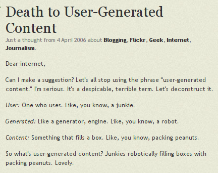
In 2006, the “restless entrepreneur” Derek Powazek posted an all in all reasonable text on his blog, “Death to User-Generated Content”, in which he suggested to get rid of the expression “user generated content” which was very actual back then and is still in use today. Good intention, this term is ugly and hypocritical. What reads strange though is the argumentation: The word user was announced to be bad, because user = junkie.
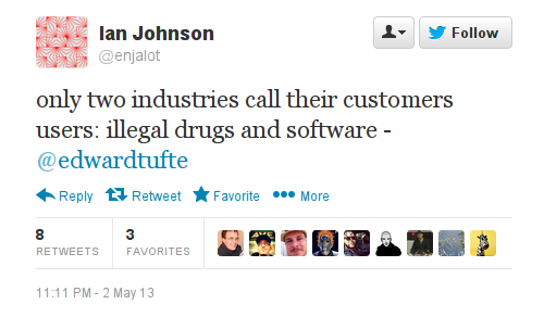
I was reminded about it when I saw a tweet quoting the “galileo of graphics”, Edward Tufte:
It is very easy to attack the word “user” on this level. But what for? To call them customers and make them see themselves as customers?
Why are reputable thinkers not using their eloquence to distinguish computer users from drug users, customers, buyers and people?
Read more on attacks on the word “user” and why the attempts to get rid of it are wrong in my Turing Complete User.
And read Raymond Williams book “The Long Revolution”(1961):
“If we were not consumers, but users we might look at society very differently, for the concept of use involves general human judgements. We need to know how to use things and what are we using them for, and also the effects of particular uses on our general life” p. 323
Dutch product designer Niels Datema made a set of spoons for baking bread at home.
When I look at them, I immediately think about modern apps. Not because Datema’s spoons are thin and shiny like mobile surfaces and interfaces (though it also adds to the mood), but because they are following the same paradigm, the same design intention to give users one tool for one task. This spoon is for flour, that one is for sugar. This is app is for writing poems, that one for writing prose. No ambiguity, no place for user improvisation.
These beautiful spoons will probably look very good in one’s kitchen. They can bring somebody who is afraid to make bread herself to the kitchen. But those spoons also suggest that there is only one recipe for bread or that you have to buy another combination of spoons for another formula. The same happens with apps. they are optimized for particular tasks and particular vendors.
Sorry for comparing software with cutlery. Couldn’t resist, since its appearance in Vachkovskij’s film, the spoon is a powerful symbol for imagining an algorithmic world, generated reality, cyberspace — for describing the Matrix. “Don’t try to bend the spoon … there is no spoon.” — Neo was advised and understood that everything is possible in the world inside the computer. It today’s matrix of adjusted and invisible interfaces there is again no spoon, and no need to try to bend one. There are myriads of spoons, pre-bended, ready to be installed.
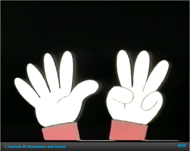
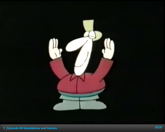
Internet Archive provides Bits and Bytes, a Canadian television series, produced by TVOntario in 1983. It is “about computers, or rather about microcomputers — the small, personal ones that are selling like hot cakes nowadays.” Despite its cheesy header and the fact that it is 30 years old, the dialogs performed by Luba Goy and Billy Van are perfect explanations of basic and some times advanced principles of real time computing. And of course it is very 8-bit, from the title song to every single example shown. Well, it was still 8-bit times.
Episode 8, Simulations and Games is especially advanced. First of all it explains why games help to learn more about reality than simulations. Secondly, it explains in one minute the concept of digital and analog.
At 5:25 a fisherman appears and describes the amount of fish he caught in the digital way:
“but if you ask the fisherman how big the fish was that got away, he is describing the quantity of missing fish in analog way.”
The elastic nature of fisherman’s memory doesn’t belong to realm of discrete and digital!
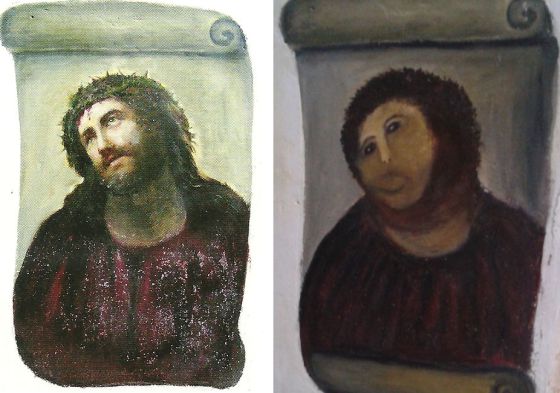
The art world is ROFLing about an epic fail that happened in Spain, at the Centro de Estudios Borjanos in Borja. A woman in her eighties restored, on her own initiative, according to her taste and skills, a 19th century painting. Read the story on EL PAIS in Spanish and on Gawker.
Whatever naive and amateur the result might appear, we should acknowledge the fact that the lady was using a mainstream restoration technique for the digital age: blurring.
Look how this technique is used by for instance art.sy, an online art platform that according to Forbes “has the potential to really shake up and transform the art industry”. Along with analog art they want to cover interactive art, screen works and net art. They received screen shots made by Rhizome’s archivist, made in a historic browser version appropriate to the work’s age, in dimensions as it would be viewed on screen. The screen shots are saved in the lossless PNG format appropriate for screen graphics and 746×436 pixels in size. Both qualities irritate the system adjusted to high resolution photo reproductions. So it converts the files to JPEGs and scales and blurs them to death.
Artsy, go to Barja, find the lady and beg her to work for you!
PS: Artsy introduced bad reproductions of screen shots shown on screen, before there were book publishers competing for the worst screen shot reproductions.
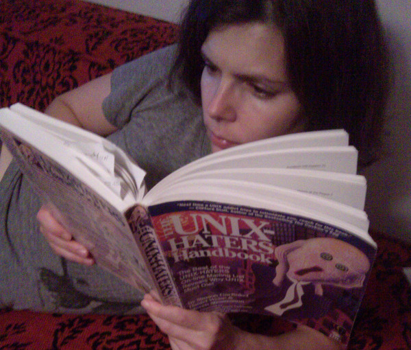
Usually, when I read a book, next to the notes on content, I bookmark curious metaphors. This tactic didn’t work with The UNIX Haters Handbook I just finished. Every page, every paragraph of it is filled with sarcastic analogies. They are flowing and cascading. This handbook is such a metaphorical bacchanalia, I wouldn’t even know what to quote.
So I paste an excerpt from the Anti-Foreword, written by Dennis Ritchie, creator of C and co-creator of UNIX:
Here is my metaphor: your book is a pudding stuffed with apposite observations, many well-conceived. Like excrement, it contains enough undigested nuggets of nutrition to sustain life for some. But
it is not a tasty pie: it reeks too much of contempt and of envy.
The 5th page of Ars Technica’s Mac OS X 10.7 Lion review by John Siracusa “Here’s to the crazy ones” covers the GUI appearances of Apple’s iCal and Adress Book software — extreme examples of metaphorical design. Both applications imitate real/paper objects by all means and in every pixel available.
The author talks about them as skeuomorphs, “derivative object[s] that retain ornamental design cues to a structure that was necessary in the original[s]”, as defined by OED. It is of course possible to see iCal in the row of classic skeuomorphs, as Siracusa and the Wikipedia article do, adding it to the row of decorative but ultimately useless rivets or wheel covers.
But following this logic we’d have to say that all metaphoric (not idiomatic) elements of user interfaces are skeuomorphic, because their only function is to remind about older days, or better to say, a pre-computer experience. And then it is not interesting anymore.
What would be really interesting instead is collecting authentic digital skeuomorphs, which in my understanding would be original (idiomatic) interface elements that are still used in current interfaces without being functional. The first example that comes to my mind is the “save” button in applications that do save automatically, like in the classic version of Google Docs.
What else? It is not easy to find examples, because of two reasons:
Interface skeuomorphs are more about functions than aesthetics.
The idea to keep elements from a digital past is not mainstream.
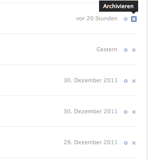
I read a new article by Jacob Nielsen on overloaded commands and wondered how can it be that in 2012, at least two decades after Interface Design started to be considered a profession, one should write about incorrectness of using the same command (button, icon) to “achieve different (but similar) results” and can provide examples from the world’s leading IT companies.
And then I saw the tweet
I looked over the shoulder of the nearest facebook user …
… indeed, X for archiving. It is not different (but similar), not even just different, but exactly the opposite. I think Jacob Nielsen can fire himself, because in 2012 as in 1993, the WWW is still made by X-Files fans.
Among other statements, Doctorow explains that you can’t regulate the internet and computers the same way you add and remove features from cars or smart phones.
He introduces a nice (even inspiring) analogy, by suggesting to see Information technology as a wheel, not as a car. He compares absurd, but more and more mainstream ideas to “fix the Internet so that it doesn’t run BitTorrent” with a fictional attempt to create a wheel that can have reduce uses.
“If I wanted Congress to […] to regulate a wheel, it’s unlikely I’d succeed. If I turned up and said “well, everyone knows that wheels are good and right, but have you noticed that every single bank robber has four wheels on his car when he drives away from the bank robbery? Can’t we do something about this?”, the answer would of course be “no”. Because we don’t know how to make a wheel that is still generally useful for legitimate wheel applications but useless to bad guys.”
We know of course, that the Internet is not a wheel, or better to say can stop being one with some lines of code, but it is so right to think this way and imagining it like this.