Web Design and Plastic Surgery
Time has come, I’d like to draw an analogy myself. Not that I think that Web Design and Plastic Surgery have a lot in common. But representatives of both professions share a certain irresponsible attitude when it comes to making things look better. Victims of nose and lip jobs, lifting and Botox look at us from glossy pages and big screens.

Cosmetic procedures don’t always lead to the ridiculous results, mostly to predictable ones. Clients want to look better or younger or sexier, but instead they get generic “after plastic”, “professionally made” look.
It is the same with redesigning websites. The history of professional web design starts with redesigning amateur pages. And like plastic surgeons would always make the same — nose smaller, tits & lips bigger– web designers would always do the same: remove GIFs, default colours and stars, bring in navigation, dropshadows, layout.
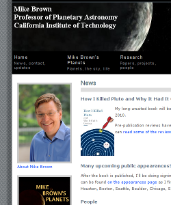
Mike Brown is a professor of Planetary Astronomy, he is “the man who killed Pluto”, his discoveries led to the demotion of Pluto from a real planet to a dwarf planet. For many years, Prof.Dr. Michael E. Brown had a self made webpage, a classic example of a transition period from Prof.Dr. to Web Vernacular.
In 2008 he re-branded himself, changing from Michael E. to Mike, and ordered a new design for his website from a design agency. The new site looks more professional, more serious. It is also dull and absolutely clumsy in its architecture. But the main trouble in this case is that web designers haven’t made an effort to enhance the original and historically significant page, but just made it generic. Small nose, big tits & lips.


Leave a Reply