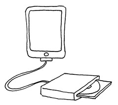
Multimedia CD-ROM

Profound Review of App Art, drawing Dragan Espenschied, 2011
Though Dragan insists that there is nothing to add to his “Profound Review of App Art”,
I’ll elaborate a bit. Fortunately we are not the only nor the first ones to notice that all this interactive entertainment that comes in the form of Apps is so much the same crap that we (net artists) fought 15 years ago.
Here is a quote from the Interfacelab.com review of the Wired Magazine App:
Earlier this year, reviewing iPad version of the Daily newspaper Scott Rosenberg noticed:
As a person who watches metaphors and idioms, I’d like to add that I enjoy the fact that in the new Millennium term Multimedia CD ROM came back as a curse.
Back to the AppArt exhibition at ZKM we happened to visit last week. It was odd to see dozens of Ipads tightly tied to the walls and podests with the on and off button sealed. And though Ipads are not PCs and should be perfect for the exhibition situation, many projects were just not working, showing new times of error messages — requests to register. Not to mention the condition of the screens. In the afternoon they were really dirty.
Paradoxically the only truly working and thats why exciting to play app was the Small Fish by interactivity masters Kiyoshi Furukawa, Masaki Fujihata und Wolfgang Münch, the work that is now 12 yers old. It was a multimedia CDROM once, then a big projection on a wall of ZKM and now an app.
Just a bunch of buttons to call up pre-defined actions of a UI is definitely not interactive.
The problem is that so much journalistic focus on new media just follows the money, or at least, they THINK they do.
Right on!
I remember saying this two years ago:
iPad + Apps + iTunes Store = Palm Pilot + CD-ROM + AOL