Version 1.1 of the Netscape browser was released in March 1995. It introduced a new weapon to the arsenal of home page makers, namely, background image attribute. Since then making or choosing a picture that would make a web page look like not a web page became the joy for generations of webmasters. And a challenge. Images had to be (still have to be) as small in file size as possible to be able to come through the line before the user is ready to click the next link. And, unlike, the wallpaper on the computer desktop, you can’t choose a motive with a fixed size.
Because webpages don’t have a fixed size, they are going to appear on the screens with unpredictable resolutions and dimensions, in browser windows that can be opened full screen, half screen, or 3/4.1 That’s why the most typical way to a make websites look like outer space, brick wall, paper, etc was to use tiny repeating images cutted smartly enough so that the borders in between the repetitions would blend smoothly and not be noticeable.2
Geocities research, and especially surfing through Hertland and SoHo neighbourhoods, made me notice some particular techniques. For example nested tables, a way to make page ornamentally rich, but still adaptive to different browser window sizes. As well as sets, that consist of a background image and navigation elements that fit to it.
Another revelation for me were bordered backgrounds or “borders”. Of course the Geocities Archive was not the first time and place I’ve seen them. But before I didn’t see how wide spread they were.
Bordered backgrounds, usually with an ornament on the left side, proved to be a risky business. They were wide in oder to prevent the border to appear second time. But what looked reasonably wide in 1995, lets say 600 pixels, looked outdated already in 1997. On my screen today such background would repeat itself 3 times.
There was also another type of bordered backgrounds, where the border was horizontal. The ornament would appear on the top of the page. They were even more problematic than vertical ones. See an example.
Vertical borders showed disbelief in technological progress, assuming that screen would not become wider than let’s say 1024 pixels. Horizontal ones showed disbelief in the users (or your own ability) to have content for a page longer than that.
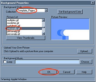
In 1999 Yahoo bought Geocities, and among other stuff introduced a tool to make web pages almost in an almost WYSIWYG way – Yahoo PageBuilder. It included a collection of graphical elements and of course a list of dozens backgrounds. With personalb.gif among them:

Personalb as well as its siblings personalr(ed), personaly(ellow) personalp(ink) and personalg(reen) has both vertical and horizontal borders. Apparently it was made for pages that wouldn’t exist for long and wouldn’t contain a lot. It is s a square of 1050×1050 pixels. There is a touching roundish notch in the corner, for the first letter of the user name.
Many Geocities profiles are build using page builder and its graphics. But personalb.gif pops up most often (subjective observation). Probably the reason is that it is a default image and appears in the PageBuilder tutorial, which is still available at the YahooSmallBusiness web hosting service.
But maybe the reason is more sophisticated? Can it be that web users were longing for the Facebook color palette already in the 1990’s?
Anyway they tried to cope with the template.
Sometimes it worked perfectly:
 |
 |
 |
| Original URL | Original URL | Original URL |
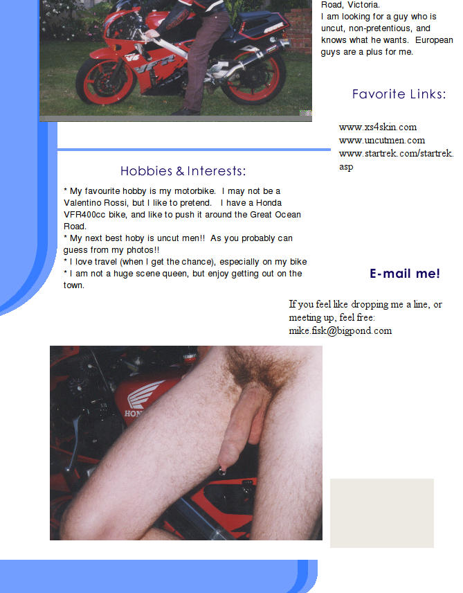
(Screenshots above are cropped, to concentrate on the left part.) With “worked” I mean, that there was exactly so much content put into the template that a page wouldn’t be longer than 1050 pixels and the blue line wouldn’t re-appear in the bottom. But even the users most loyal to the template (those with very laconic profiles) couldn’t cheat time, so personalb.gif treacherously repeats in the right corner of their pages today. Like in the example below:
 |
| Original URL |
There are many examples, where you see that users gladly used the profile even when they saw that their content wouldn’t fit into 1050 pixels.
 |
 |
 |
| Original URL | Original URL | Original URL |
The last example is most extreme, because personalb.gif repeats 12 times. The page is really long. One can ask why would those users choose a background that is obviously too short for their purpose? Are they blind? But may be not. And by choosing a background image that is too small they intended to emphisize how huge are the things they want to say and show.
Despite several interesting examples I found after analyzing 44 pages build with the PersonalPageBlue template, and beside noticing a curious tendency to use different yahoo templates on different pages within one profile, I should conclude that PersonalPageBlue does not look disturbing in two cases.
1. When it is left empty
 |
 |
 |
| Original URL | Original URL | Original URL |
2. If it would be gorgeous anyway.
